Plotting
Once you have the metrics results for a set of learning strategies you can plot the behaviour the evolution of the metrics:
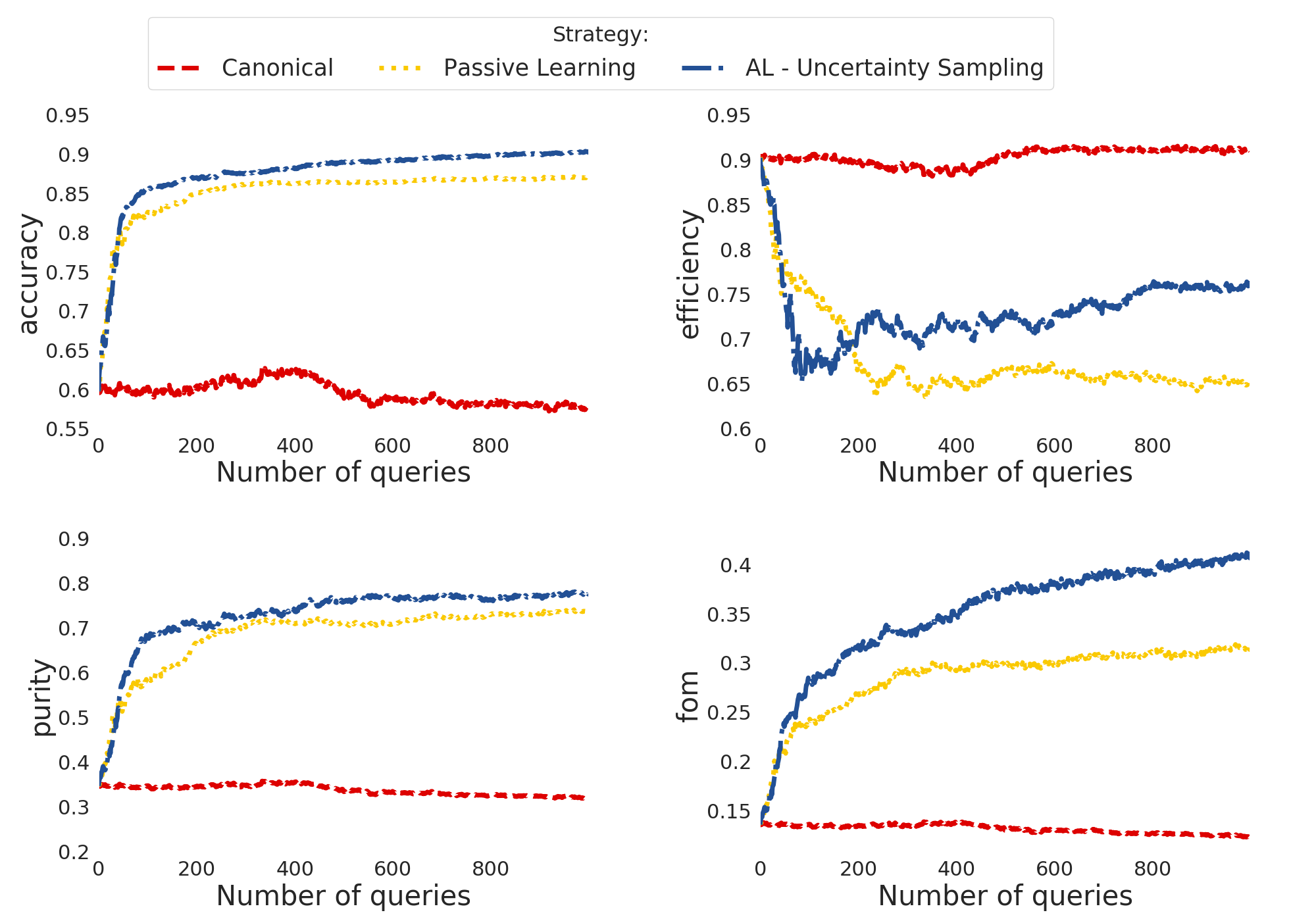
Accuracy: fraction of correct classifications;
Efficiency: fraction of total SN Ia correctly classified;
Purity: fraction of correct Ia classifications;
Figure of merit: efficiency x purity with a penalty factor of 3 for false positives (contamination).
The class Canvas <https://actsnclass.readthedocs.io/en/latest/api/actsnclass.Canvas.html#actsnclass.Canvas>_ enables you do to it using:
 1>>> from actsnclass.plot_results import Canvas
 2
 3>>> # define parameters
 4>>> path_to_files = ['results/metrics_canonical.dat',
 5>>>                  'results/metrics_random.dat',
 6>>>                  'results/metrics_unc.dat']
 7>>> strategies_list = ['Canonical', 'RandomSampling', 'UncSampling']
 8>>> output_plot = 'plots/metrics.png'
 9
10>>> #Initiate the Canvas object, read and plot the results for
11>>> # each metric and strategy.
12>>> cv = Canvas()
13>>> cv.load_metrics(path_to_files=path_to_files,
14>>>                    strategies_list=strategies_list)
15>>> cv.set_plot_dimensions()
16>>> cv.plot_metrics(output_plot_file=output_plot,
17>>>                    strategies_list=strategies_list)
This will generate:
Alternatively, you can use it directly from the command line.
For example, the result above could also be obtained doing:
>>> make_metrics_plots.py -m <path to canonical metrics> <path to rand sampling metrics>  <path to unc sampling metrics>
>>>        -o <path to output plot file> -s Canonical RandomSampling UncSampling
OBS: the color pallete for this project was chosen to honor the work of Piet Mondrian.